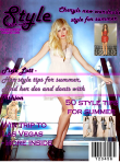
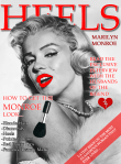
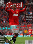
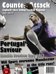
I am sure creating magazine covers are one of those projects that happen in most schools. This is not revolutionary by any means but it is a good way to help students understand graphic design, audience, purpose as well as some more advanced Adobe Fireworks skills.
In order for students to create magazine covers that actually look authentic they must do some research. What do covers look like in WH Smith or Newstand on iPad?
This seems faily obvious, but far too many times I have seen posters, rather than magazine covers. I will admit to you now that I am bit fussy about what is produced. Although, that is true of any teacher.
Some of the skills required in this project do crossover with the album covers in the 3rd year. However, whilst we do some basic image editing it is not as advanced. I prefer to focus more on arranging elements, design themes and reproducing what they have seen, while still making their covers unique.
I hope you enjoy these examples.


Nice post.Thank you for taking the time to publish this information very useful! I’m still waiting for some interesting thoughts from your side in your next post thanks.
Ines Rivero
If I were to critic the magazine cover I would say that the middle text is a little too small. But other than that, good work!
Awesome post!